creates visualizations for homophily analysis results from homophily().
the function can create different types of plots including similarity distributions,
comparison plots across multiple attributes, and temporal evolution plots.
Arguments
- homophily_results
data frame output from
homophily()or a list of such data frames for comparison plots.- netlet
optional. the netify object used in the analysis. required for distribution plots to extract actual similarity data.
- type
character string specifying the plot type:
- "distribution"
shows similarity score distributions for connected vs unconnected pairs (requires netlet)
- "comparison"
compares homophily across multiple attributes
- "temporal"
shows homophily evolution over time (for longitudinal data)
- attribute
character string. for distribution plots, specifies which attribute to visualize. should match the attribute used in
homophily().- method
character string. for distribution plots, the similarity method used. should match the method used in
homophily().- sample_size
integer. for distribution plots with large networks, the number of dyad pairs to sample for visualization. default is NULL (use all pairs).
- colors
character vector of two colors for connected/unconnected or significant/non-significant pairs. default uses package theme colors.
- ...
additional arguments passed to ggplot2 functions.
Examples
# \donttest{
# load example data
data(classroom_edges)
data(classroom_nodes)
# create a network with nodal attributes
ntwk <- netify(
classroom_edges,
actor1 = "from", actor2 = "to",
symmetric = TRUE,
nodal_data = classroom_nodes
)
# run homophily analysis
homophily_result <- homophily(
ntwk,
attribute = "gender",
method = "categorical",
n_permutations = 100
)
# create distribution plot
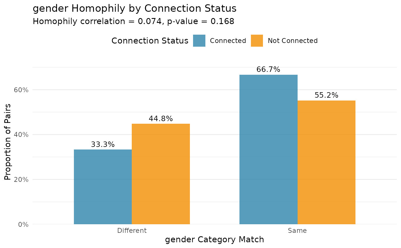
plot_homophily(
homophily_result,
netlet = ntwk,
type = "distribution",
attribute = "gender",
method = "categorical"
)
#> ℹ Similarity matrix: 30x30
#> ℹ Binary network: 30x30
#> ℹ Similarity keys: 870, Binary keys: 870
#> ℹ Matched: 870, Unmatched: 0
#> ℹ Similarity data dimensions: 870 rows x 2 cols
#> ℹ Connected levels: Connected, Not Connected
#> ℹ Connected counts: Connected=102, Not Connected=768
 # }
# }